3 Tips to Create Better Forms for Your Website
- Category : Development
- Posted on : Apr 23, 2017
- Views : 3,671
- By : Ingavar J.
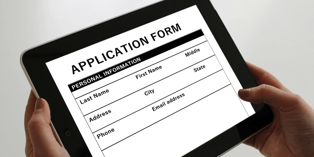
Forms are simple elements with a wide variety of applications. You can use a form on your website to let visitors contact you with questions, collect email addresses, or even solicit feedback. However, your forms won’t accomplish much unless they’re carefully designed.
The good news is that creating an effective form is a simple process. Actually building a form is quick, as long as you have the right tools. After that, you can follow a few basic guidelines to ensure that your form is user-friendly and achieves its goal.
In this article, we’ll talk about the reasons you might need a form on your website. We’ll then discuss three smart tips for designing better forms. Let’s get started!
The Benefits of Using Forms on Your Website
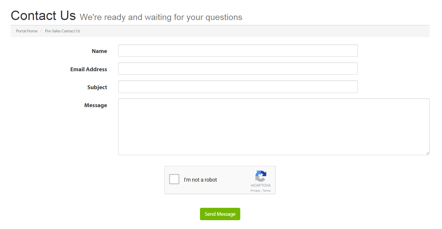
No matter what type of website you’re running, you’ll likely need a way to connect directly with your visitors. Blog writers may want to solicit feedback, business site owners will need to provide customers with a method for asking questions, and marketers are always looking for new leads.
The best solution for this is using contact forms. By adding a customized form to your site, you can:
- Give visitors a simple way to contact you.
- Solicit exactly the information you need.
- Keep people on your site, instead of asking them to contact you via email or phone.
Forms can be applied in a variety of ways, although most fall into one of two camps. Some are used to collect email addresses and personal details – usually to build an email list. Forms can also give people a way to ask questions, provide feedback, and request help.
It’s important to understand what the goals of your form are before you create it. That way, you’ll know how to customize it and what fields to include. Now, let’s take a closer look at the process of actually building a successful form.
3 Tips to Create Better Forms for Your Website
Once you know what type of form you need on your website, all that’s left is to create it. Putting together a form is usually simple, although it will depend somewhat on the tool you’re using.
However, there’s more to building an effective form than simply adding a few basic fields. In the next few sections, we’ll explore three tips for creating better forms!
1. Keep the Number of Fields to a Minimum
It can be tempting to use your contact form to solicit all potentially useful information about a visitor. However, doing this is risky.
The more fields you include in a form, the less likely people are to complete it. Asking visitors to provide too much information can frustrate them, or even make them suspicious. This means you’ll want to keep your forms short whenever possible.
What fields your form requires will depend on its purpose. Before adding new fields, ask yourself if you really need that information up front. Remember that you can always ask for more details later on.
Fortunately, nearly any form builder solution will let you add or subtract whatever fields you like. If you’re a WordPress user, Ninja Forms is a perfect example:

When you create a form using this plugin, you can choose to start with either a blank slate or a template with some basic fields already included. Then you can add in whatever fields you like, while removing any you don’t need:
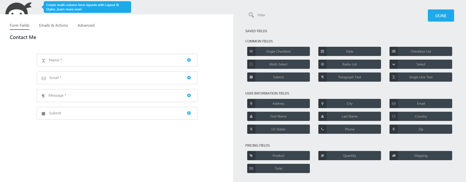
This building-blocks approach makes putting together a form simple, and Ninja Forms is a fairly comprehensive tool. If you want even more options and flexibility, you can opt for a premium form-builder plugin such as Gravity Forms instead.
2. Use Visual Constraints to Make Your Forms More Readable
Once you know what fields you want to include in your form, you’ll want to give some thought to how they actually look. This is particularly important if you do end up with more than two or three fields.
The standard approach is to list out all the fields in one equal-width column, like this:

While this is okay, you can use ‘visual constraints’ to make improvements. This simply means making each field longer or shorter to match the length of the information it will contain. By doing that, you give users visual cues that will help them complete the form more quickly.
The Caldera Forms plugin is one tool that makes this technique simple:

When working on a form, you can easily drag the ends of each field to make it longer or shorter. Plus, you can place multiple fields next to each other:
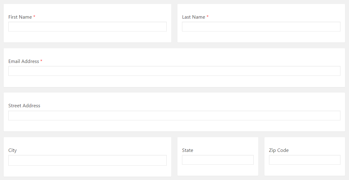
This version of the form is much easier for visitors to scan. At the same time, it helps them intuitively grasp how much information is needed in each individual field.
3. Set Up Notifications So You Know When Forms Are Submitted
Once your form is live, it’s crucial that you respond to all inquiries quickly. Internet users are notoriously impatient, and you’ll want to make a good first impression. That means you need to set up notifications informing you when the contact form has been filled out.
What about forms that don’t necessarily require a response, such as those designed to collect email addresses? Even in these cases, it can be useful to get an instant confirmation every time a visitor fills out the form. That way you can add their email to your list immediately, and maybe even send a welcome message.
Each form builder tool has its own way of letting you know when forms are submitted. It’s worth looking for a solution that lets you set up instant notifications, such as the Contact Form by WPFormsplugin:

Aside from letting you create and customize forms, WPForms makes it simple to configure notifications. When you’re setting up a new form (or editing an existing one), you can navigate to Settings > Notifications to find this feature:
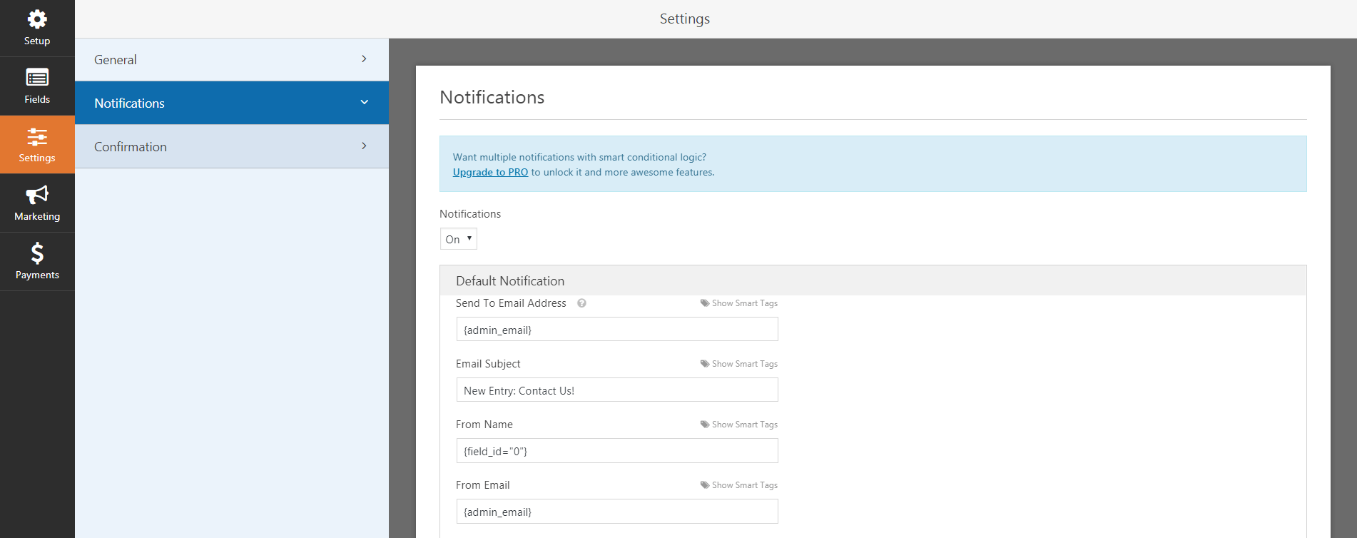

Simply ensure that Notifications is set to On. You can use the following fields to decide what email addresses will be notified, and design the email that will be sent. Save your changes, and you’ll never miss another submission again!
Conclusion
Nearly every website can benefit from a form or two. This feature makes it easier for visitors to contact you, simplifies the process of gathering email addresses and other key information, and more. Fortunately, creating a form that does its job well is achievable even for a beginner.
To recap, here are three ways you can build better forms for your website:
- Keep the number of fields to a minimum.
- Use visual constraints to make your forms more readable.
- Set up notifications so you know when forms are submitted.
Categories
- cPanel Question 47
- cPanel Software Management 29
- cPanel Tutorials 13
- Development 29
- Domain 13
- General 19
- Linux Helpline (Easy Guide) 156
- Marketing 47
- MySQL Question 13
- News 2
- PHP Configuration 14
- SEO 4
- SEO 42
- Server Administration 84
- SSL Installation 54
- Tips and Tricks 24
- VPS 3
- Web Hosting 44
- Website Security 22
- WHM questions 13
- WordPress 148
Subscribe Now
10,000 successful online businessmen like to have our content directly delivered to their inbox. Subscribe to our newsletter!Archive Calendar
| Sat | Sun | Mon | Tue | Wed | Thu | Fri |
|---|---|---|---|---|---|---|
| 1 | 2 | 3 | ||||
| 4 | 5 | 6 | 7 | 8 | 9 | 10 |
| 11 | 12 | 13 | 14 | 15 | 16 | 17 |
| 18 | 19 | 20 | 21 | 22 | 23 | 24 |
| 25 | 26 | 27 | 28 | 29 | 30 | |
Recent Articles
-

Posted on : Sep 17
-

Posted on : Sep 10
-

Posted on : Aug 04
-

Posted on : Apr 01
Tags
- ts
- myisam
- vpn
- sql
- process
- kill
- tweak
- server load
- attack
- ddos mitigation
- Knowledge
- layer 7
- ddos
- webmail
- DMARC
- Development
- nginx
- seo vpn
- Hosting Security
- wireguard
- innodb
- exim
- smtp relay
- smtp
- VPS Hosting
- cpulimit
- Plesk
- Comparison
- cpu
- encryption
- WHM
- xampp
- sysstat
- optimize
- cheap vpn
- php-fpm
- mariadb
- apache
- Small Business
- Error
- Networking
- VPS
- SSD Hosting
- Link Building
- centos
- DNS
- optimization
- ubuntu


