How to Pick the Right Colors to Use in Your Web Designs
- Category : Development
- Posted on : Dec 07, 2017
- Views : 3,101
- By : Zane P.
One of the most important considerations when designing a website is what colors to use. If you pick your website’s color scheme at random, chances are the results won’t look as good as they might if you took your time with this design decision. Poor color choice can even negatively impact your site’s overall usability.
Relying on your intuition and good taste isn’t always the best approach when it comes to choosing your website’s color palette. Fortunately, there are several simple tricks you can use to find the best options. If you take advantage of them, your color palette will always be on point, and your websites will stand out in a sea of drab designs.
In this article, we’re going to talk about why your color choices matter when it comes to web design. We’ll then help you pick the perfect colors for your next website in three simple steps. Let’s get to work!
Why Colors Matter in Web Design
You might think of colors as just another background element on the websites you use and create. In reality, however, a lot of thought probably went into choosing the colors your favorite websites rely on.
Let’s talk about some of the reasons your choice of colors is so important:
- The right color palette can help increase readability. The colors you pick play a significant role when it comes to readability.
- Contrasting colors can make essential elements stand out. Using well thought-out color contrasts can help certain elements stand out. For example, Calls-to-Action (CTAs) usually feature bold colors to attract your attention.
- Complementary colors are pleasing to the eye. A matching color palette is pleasant to look at, and won’t distract from your website’s content.
- Colors can become a memorable part of your brand. Some colors have even become iconic due to their associations with particular brands, such as Coca-Cola’s red shade.
The first thing you’ll want to do is take a moment to step back and look at the colors you’re using on your site right now. Chances are there are some changes you can make to improve your choices, so let’s talk about how to get started.
How to Pick the Right Colors For Your Next Web Design Project (In 3 Steps)
The tips we’re going to discuss below apply to all types of design – not just websites. If you want to learn more, you should look into the concepts of contrast, complementation, and vibrancy in design. We’re going to expand on these terms below, but there’s much more to the topic than we can cover in a single post!
Step 1: Pick a Dominant Color for Your Design
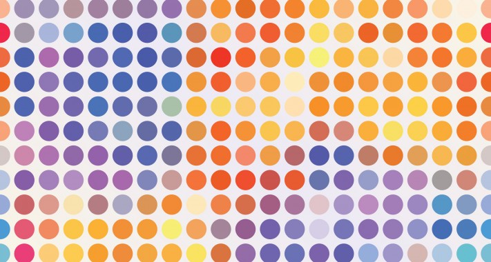
Almost every website uses a dominant color, one that shows up frequently throughout its design. One excellent example of this is Facebook, which uses blue predominantly throughout the site:

This isn’t a matter of laziness – using the same color for your website’s key elements helps to create a consistent experience. Ideally, visitors should come to associate your primary color with your website and brand. More importantly, once you’ve settled on a primary color, creating a color palette is much simpler. After all, you won’t be choosing colors at random, but rather picking options that work with your primary hue.
Which color to pick as your dominant tone is a highly personal consideration. It will mostly come down to personal taste, and any established branding you already have. However, you should keep in mind that people associate different colors with specific feelings and actions. Some common examples include:
- Blue: Blue is most often associated with men, stability, and productivity.
- Red: Brands often use red to stimulate purchases, rash decisions, and hunger.
- Green: Most often, green is used to reflect health and nature.
You may want to read more about color theory before you settle on a primary tone. However, if you have a unique color in mind for your design already, don’t be afraid to take it for a test drive throughout the next two steps.
Step 2: Find Colors Analogous to Your Primary Hue
When you’ve chosen a primary color, it’s time to pick some matching secondary colors. One way you can do this is by finding analogous colors. These are colors that are similar to the primary shade, which you can use to create a more vivid tone.
In most cases, we recommend using at least one analogous tone throughout your design. However, more is usually better. The best way to find these tones it is to use a color wheel tool. Color wheels are visual representations of the relationship between primary colors:
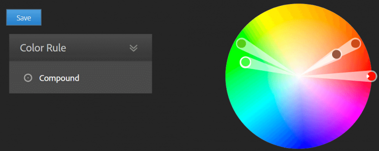
Using a color wheel to help you find analogous colors is simple. Just find your primary tone on the wheel, and look for colors that are close by. They’ll be variations of your primary hue:
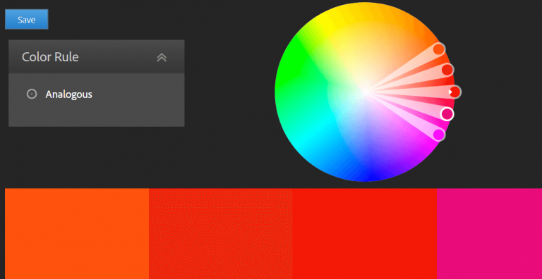
Any online color wheel tool will provide you with specific HEX and RGB codes, which you can use to implement your chosen colors on your website. As for when to use the analogous colors, you’ll want to use a secondary color to complement your primary shade, and one or more tertiary colors for accents.
Step 3: Look for Contrasting Colors to Highlight Important Elements
In color theory, shades with high contrast are called complementary colors. To find a hue that complements your primary color, just take a look at the exact opposite side of the color wheel:
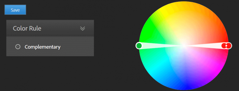
Complementary colors offer a high amount of contrast, so they make a strong visual impression. If you want to expand your palette, you can also use the two colors adjacent to your original tone’s complement.
By doing that, you’ll have three complementary colors to choose from. For example, if you chose dark blue as your primary color, your complementary tones would be orange, yellow, and a darker shade of orange:
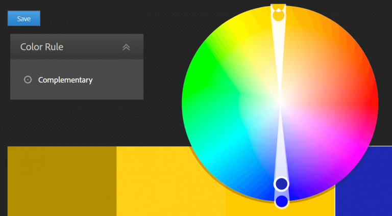
In most cases, you’ll want to apply complementary colors more sparingly than analogous tones. One way you can use them is to ensure that key website elements stand out, such as CTAs and social media icons. In such cases, using complementary colors is a great way to ensure that these features are highly visible.
Conclusion
When it comes to web design, colors shouldn’t be an afterthought. Even if your pages are stunning, you’ll need to use the right colors to ensure that each element captures your visitors’ attention. Relying on instinct alone can sometimes lead you astray, so we recommend taking a more analytical approach.
When it comes to choosing the right colors for your next web project, you’ll want to follow these steps:
- Pick a dominant color for your designs.
- Find colors that complement your primary hue.
- Look for colors that contrast with your primary tone, to highlight important elements.
Categories
- cPanel Question 47
- cPanel Software Management 29
- cPanel Tutorials 13
- Development 29
- Domain 13
- General 19
- Linux Helpline (Easy Guide) 156
- Marketing 47
- MySQL Question 13
- News 2
- PHP Configuration 14
- SEO 4
- SEO 42
- Server Administration 84
- SSL Installation 54
- Tips and Tricks 24
- VPS 3
- Web Hosting 44
- Website Security 22
- WHM questions 13
- WordPress 148
Subscribe Now
10,000 successful online businessmen like to have our content directly delivered to their inbox. Subscribe to our newsletter!Archive Calendar

| Sat | Sun | Mon | Tue | Wed | Thu | Fri |
|---|---|---|---|---|---|---|
| 1 | 2 | 3 | ||||
| 4 | 5 | 6 | 7 | 8 | 9 | 10 |
| 11 | 12 | 13 | 14 | 15 | 16 | 17 |
| 18 | 19 | 20 | 21 | 22 | 23 | 24 |
| 25 | 26 | 27 | 28 | 29 | 30 | 31 |
Recent Articles
-

Posted on : Sep 17
-
Posted on : Sep 10
-

Posted on : Aug 04
-
Posted on : Apr 01
Tags
- ts
- myisam
- vpn
- sql
- process
- kill
- tweak
- server load
- attack
- ddos mitigation
- Knowledge
- layer 7
- ddos
- webmail
- DMARC
- Development
- nginx
- seo vpn
- Hosting Security
- wireguard
- innodb
- exim
- smtp relay
- smtp
- VPS Hosting
- cpulimit
- Plesk
- Comparison
- cpu
- encryption
- WHM
- xampp
- sysstat
- optimize
- cheap vpn
- php-fpm
- mariadb
- apache
- Small Business
- Error
- Networking
- VPS
- SSD Hosting
- Link Building
- centos
- DNS
- optimization
- ubuntu