3 Tools to Help You Test Your Mobile Website
- Category : Development
- Posted on : Apr 11, 2017
- Views : 2,903
- By : Tadashi P.

These days, mobile traffic is critical to the success of most websites. If your site doesn’t look good on mobile devices, you may end up scaring a lot of those users away. That means you’ll need to test your site rigorously before it goes live, if you want to compete.
Fortunately, the testing process isn’t that complicated. You just need to make sure your website looks compelling and works across as many devices as possible, which is where testing tools come in. These solutions enable you to simulate multiple types of devices, in order to maximize your website’s compatibility. That way, you won’t have to purchase dozens of smartphones and tablets to test your site on.
In this article, we’re going to talk about why testing your website for mobile devices is important, and introduce you to three tools to help you do it. Let’s get to work!
Why It’s Important to Test Your Website for Mobile Devices
The way a website looks and works changes depending on the device used to view it. One browser might not support a particular feature, for example, or your layout may look different when you see your website at smaller resolutions.
The point is that testing your site thoroughly for mobile devices is a smart move. Here are just two of the reasons why:
- Mobile traffic is on the rise. A lot of people do most of their online browsing using mobile devices, so you need to ensure that your website offers those visitors a quality experience. That way, you’ll increase the likelihood that they’ll come back.
- Some elements behave differently at smaller resolutions. Mobile devices are almost always smaller than desktop computers, so you have less screen space to work with. Text, images, and pretty much every other element will be reduced in size, which can make them difficult to interact with. Testing enables you to identify any problem areas and fix them quickly.
Chances are that at some point you’ve had to deal with a website that wasn’t optimized for mobile devices, so you’ll know how frustrating that can be. Simply testing your site on a couple of mobile devices is enough to weed out most significant errors, so there’s no reason not to do it.
3 Tools to Help You Test Your Mobile Website
Checking your website for errors on mobile devices is something you don’t necessarily need a special tool for. All that’s required are several mobile devices of different makes and resolutions, and you’re in business. However, not everyone has dozens of smartphones and tablets lying around. That’s where the following three solutions come in handy.
1. Chrome DevTools

The Chrome DevTools is a set of features built into your browser, which enable you to test and debug any pages you come across. For example, you can check out how long any given page takes to load, see what its elements are, and even tweak its Cascading Stylesheets (CSS) and see your changes implemented live.
As far as mobile testing goes, the Chrome DevTools lets you see what your website will look like using smaller resolutions. You can choose from among a list of popular devices with resolutions you want to simulate, and even change their orientation on the fly.
If you’re a developer, you’ll appreciate all the things Chrome DevTools enables you to check without having to set up additional software. Plus, it makes mobile testing easy – all you have to do is right-click on any page and choose the Inspect option to get started.
Key Features:
- Conduct your tests using tools built into Google Chrome.
- Simulate the resolutions of dozens of mobile devices.
- Change the orientation of your website at any time with a single click.
- Choose from among a list of devices to test, or input your own custom resolution.
Price: Chrome DevTools is 100% free, which makes it an excellent budget option.
2. CrossBrowserTesting

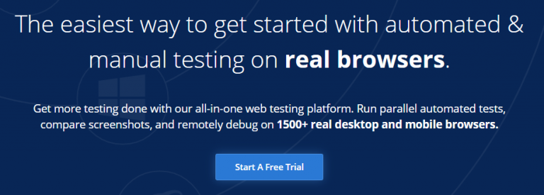
If you want to be as efficient as possible in your tests, CrossBrowserTesting might just be the service for you. This platform enables you to test your websites on simultaneously on over a thousand combinations of different browsers and mobile devices.
These mobile devices aren’t simulated, as is the case with other, similar services. Instead, you get access to real devices that have been set up for these tests. You can even interact with these devices remotely, to find out how your website behaves.
If you’re more concerned with visual bugs, CrossBrowserTesting can also provide you with full side-by-side comparisons of how your site looks across different mobile devices. That way, you’ll be able to quickly catch any errors.
Key Features:
- Test your website using over a thousand combinations of browsers and mobile devices.
- Compare screenshots of your website as seen from different mobile devices.
- Interact with real mobile testing devices over the web.
Price: CrossBrowserTesting is a premium service, and prices start at $29 per month. It’s relatively expensive for small sites, but ideal for teams of developers working on multiple web projects.
3. BrowserStack

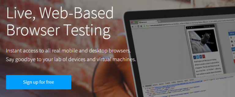
At first glance, BrowserStack is very similar to CrossBrowserTesting. Both services offer you the option to test your website on real mobile devices. However, BrowserStack also uses official Android and iOS emulators, if you prefer that approach.
You’ll also get access to a screenshot comparison feature, which lets you see how your website displays on multiple mobile devices. To get the most out of your tests, BrowserStack covers nearly every resolution available between 800 x 600 and 2048 x 1536, which covers the mobile gamut quite well.
There isn’t a clear winner between BrowserStack and CrossBrowserTesting. Both services offer a lot of the same features, so it comes down to personal preference and which interface you prefer. If you need to run a lot of mobile compatibility tests, either option will be right up your alley.
Key Features:
- Test your website across thousands of browser and mobile device configurations.
- Gain access to real mobile devices, and emulated ones if needed.
- Take thousands of screenshots of your website to check how it looks across multiple resolutions.
Price: BrowserStack plans also start at $29 per month. It’s an excellent service if you need to run a lot of tests, but may be less viable for a single website. Keep in mind, however, that you can always use the platform’s free trial if you just want to test one site.
Conclusion
Making sure that your website looks and works great on mobile devices is critical to its success. The good news is that in most cases, you don’t need to worry about individual devices per se, but rather about screen resolutions. However, it still pays off to test your website using as many mobile devices as possible, just to be safe.
Here are three tools that can help you run your mobile tests more efficiently:
- Chrome DevTools: This free tool is great for running individual tests from time to time.
- CrossBrowserTesting: This is a premium service that’s perfect for continuous testing on mobile devices.
- BrowserStack: This premium platform provides you with access to thousands of browser and mobile device combinations.
Categories
- cPanel Question 47
- cPanel Software Management 29
- cPanel Tutorials 13
- Development 29
- Domain 13
- General 19
- Linux Helpline (Easy Guide) 156
- Marketing 47
- MySQL Question 13
- News 2
- PHP Configuration 14
- SEO 4
- SEO 42
- Server Administration 84
- SSL Installation 54
- Tips and Tricks 24
- VPS 3
- Web Hosting 44
- Website Security 22
- WHM questions 13
- WordPress 148
Subscribe Now
10,000 successful online businessmen like to have our content directly delivered to their inbox. Subscribe to our newsletter!Archive Calendar
| Sat | Sun | Mon | Tue | Wed | Thu | Fri |
|---|---|---|---|---|---|---|
| 1 | 2 | 3 | ||||
| 4 | 5 | 6 | 7 | 8 | 9 | 10 |
| 11 | 12 | 13 | 14 | 15 | 16 | 17 |
| 18 | 19 | 20 | 21 | 22 | 23 | 24 |
| 25 | 26 | 27 | 28 | 29 | 30 | |
Recent Articles
-

Posted on : Sep 17
-

Posted on : Sep 10
-

Posted on : Aug 04
-

Posted on : Apr 01
Tags
- ts
- myisam
- vpn
- sql
- process
- kill
- tweak
- server load
- attack
- ddos mitigation
- Knowledge
- layer 7
- ddos
- webmail
- DMARC
- Development
- nginx
- seo vpn
- Hosting Security
- wireguard
- innodb
- exim
- smtp relay
- smtp
- VPS Hosting
- cpulimit
- Plesk
- Comparison
- cpu
- encryption
- WHM
- xampp
- sysstat
- optimize
- cheap vpn
- php-fpm
- mariadb
- apache
- Small Business
- Error
- Networking
- VPS
- SSD Hosting
- Link Building
- centos
- DNS
- optimization
- ubuntu


